
Green vs Teal Sapphire Engagement Rings: Color, Cut and Lighting

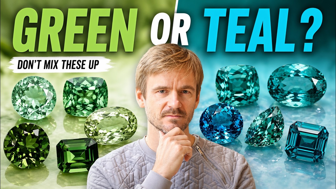
If you are considering a green or teal sapphire engagement ring, the first thing I would check is whether the color on your screen represents the stone you will actually wear.
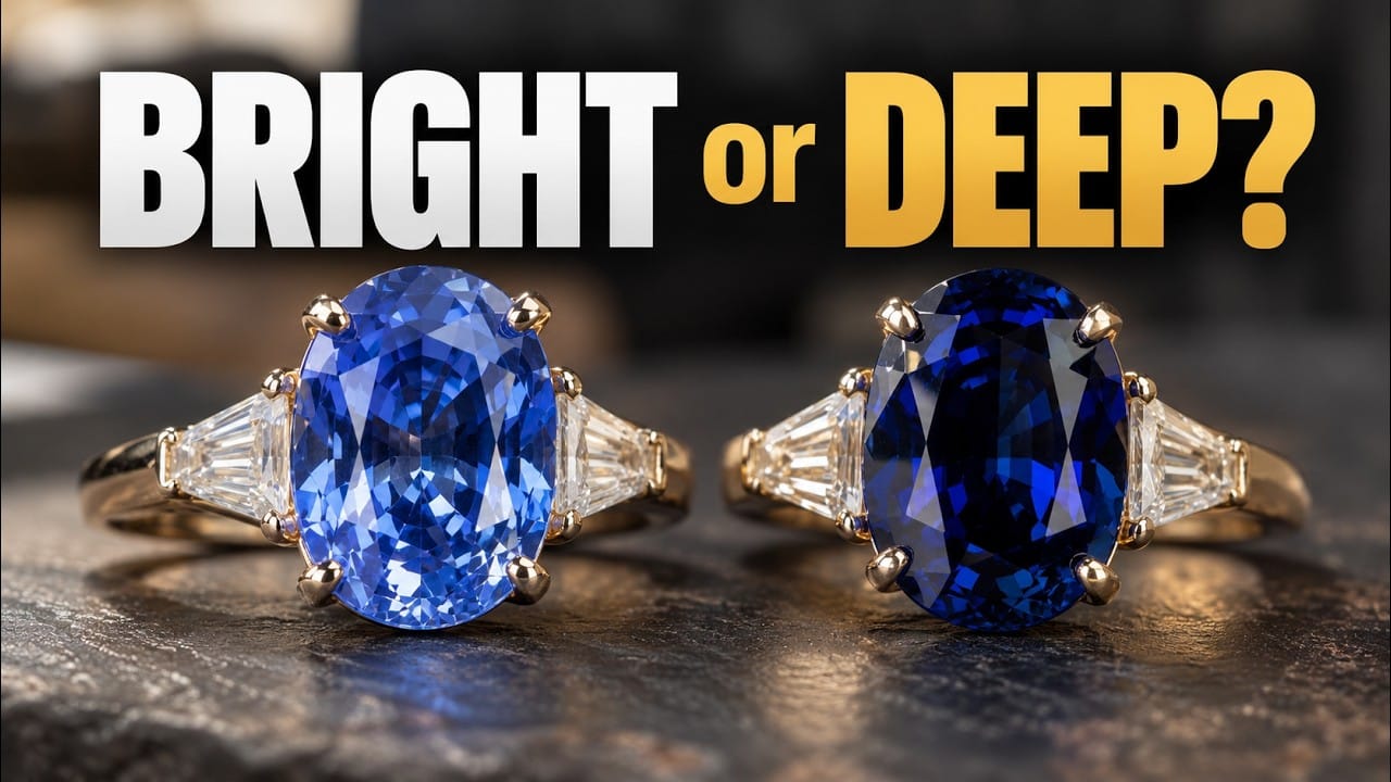
A photograph made under flattering lighting can make a sapphire look brighter, bluer or greener than it appears in an ordinary room. Editing, exposure, background and white balance can all add to the difference. That perfect teal image may not tell you how the stone behaves on the hand.
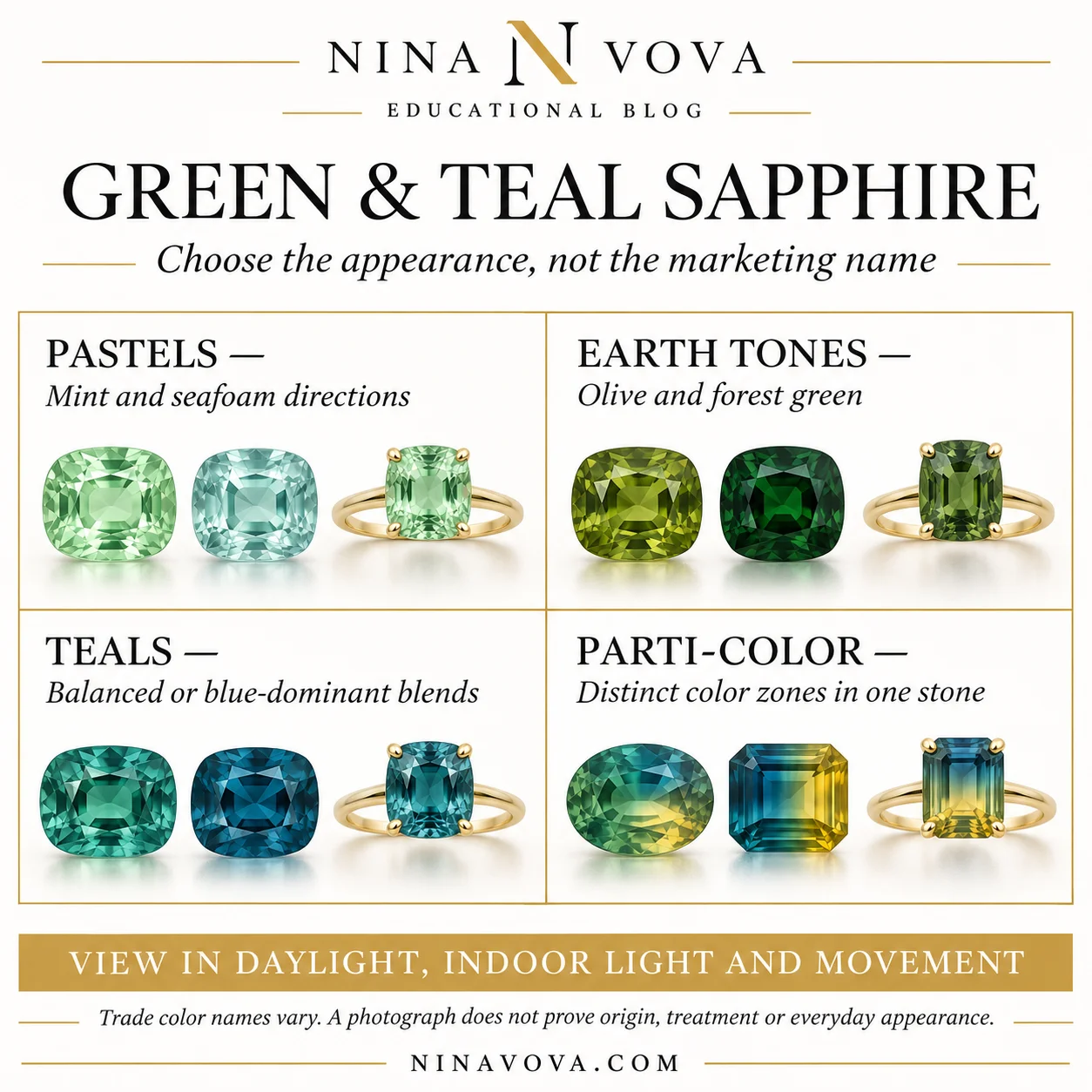
I find it useful to organize the choices into pastels, earth tones, blended teals, parti-color stones and origin considerations. These are ways to describe a preference, not universal laboratory grades. The aim is to give a jeweler a clear visual brief and then compare actual stones.
Describe the color you want, then compare the actual sapphire. Mint, seafoam, mermaid and peacock are useful conversation starters, but their meanings vary. Lighting, tone, cutting and the setting can change the result. Ask for ordinary-light views and documentation for material, treatment and origin claims.
At a glance · Color on a screen and in real life · Sapphire durability and everyday wear · Mint sapphire · Seafoam sapphire
Watch the NinaVova discussion
Watch the original NinaVova video on YouTube.
Green and teal sapphire directions at a glance
| Direction | What it may suggest | What to check |
|---|---|---|
| Mint or seafoam | Paler green or a cool blue-green influence | Brightness, windowing and color against the intended metal. |
| Olive or forest | Warmer yellow-green or a deeper green appearance | Whether the actual tone stays attractive away from bright display lighting. |
| Mermaid or peacock teal | Balanced or blue-dominant green-blue blends | What the seller means; use reference examples rather than fixed percentages. |
| Peacock-style flashes | Blue with visible green reflections in movement | Actual behavior rather than a trade name alone. |
| Parti or bi-color | Distinct zones in the same crystal | Face-up zoning, cutting and movement in ordinary lighting. |
| Montana or Australian origin | A locality claim with varied possible colors | Relevant documentation; color by itself does not establish origin. |
Color on a screen and in real life
Green and teal sapphires can change their apparent balance under different light sources and viewing angles. The direction and strength depend on the individual stone; I would not promise that every sapphire becomes greener outdoors and bluer indoors.
Ask for daylight, ordinary indoor light and a moving view, keeping the background and exposure as consistent as possible. See the sapphire over skin as well as against a neutral surface. A single ideal photograph cannot show all of those conditions.
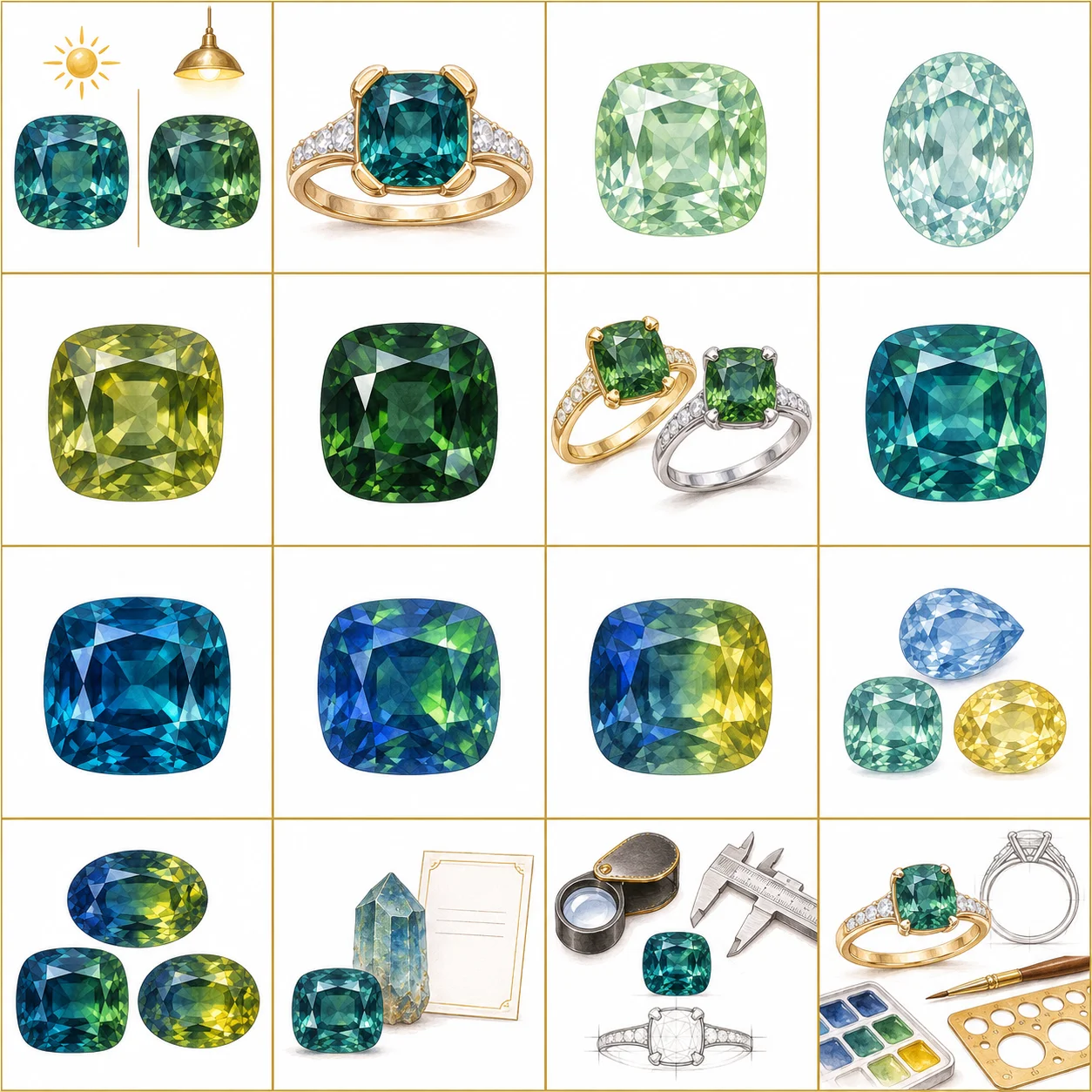
The NinaVova video offers a practical discussion of these color directions. The illustrations in this article are concepts, while the original product photographs are identified separately. Neither an illustration nor a photograph proves a stone’s origin or treatment status.
Sapphire durability and everyday wear
Sapphire is corundum and ranks 9 on the Mohs scale, which makes it a strong colored-gem candidate for many engagement rings. Scratch resistance is only part of the decision: existing fractures, vulnerable points, the setting and the wearer’s habits still matter.
If the person loves green, compare sapphire and emerald as different materials rather than assuming they will wear the same way. Emerald’s clarity characteristics and treatments can require different care. A durable gem also needs a design built for the way the ring will be used.
Mint sapphire
Mint is a useful description for a pale, crisp green direction. It can be an attractive starting point for someone who wants a light, fresh ring rather than a heavy or moody center.
Lighter tone can help a well-cut sapphire feel open and bright, but the word mint does not guarantee light return or mean it can never look dark. I would still inspect the cut, any window through the center and the appearance in ordinary indoor light.
Seafoam sapphire
Seafoam usually suggests a soft green with a cool blue component. Compared with the mint direction, it can feel icier and more blue-green.
Those words are useful when you are narrowing a design, but sellers do not all draw the same boundary. Show the jeweler reference examples and explain whether you want more green, more blue or a lighter overall tone. Then check the exact stone against the intended metal and skin tone.
Olive sapphire
Olive describes a green direction with a noticeable yellow influence. That warmth can suit an earthy, vintage or botanical design, especially when the overall color remains lively.
Yellow gold may support that warm impression, but I would compare the actual sapphire beside the alloy you are considering. An attractive olive should be chosen for its appearance across useful lighting conditions, rather than for one beautiful golden-hour image.
Forest-green sapphire
A deeper forest green can be rich and dramatic. This is also where I would be especially careful about a center that looks almost black away from bright display lighting.
Large dark areas can involve tone, cut, orientation, lighting and obstruction; they are not proof of poor cutting alone. Good cutting can help, but it does not automatically overcome a very dark stone. I want to see useful flashes and an attractive face-up appearance in the conditions where the ring will actually be worn.
Choosing the setting and metal
Color is only the beginning. The stone, lighting and surrounding metal all contribute to the finished impression. For an olive sapphire, yellow gold may reinforce warmth. For a pale seafoam direction, white gold or platinum may suit the cooler palette.
Those are design possibilities rather than fixed rules. I would compare real samples and pay attention to the whole setting, including profile, prong placement and how a wedding band will fit.
At NinaVova, the value of custom work is developing the proportions and details around the selected gem and the person’s life. A color name cannot do that work for us.

Mermaid-style teal
Teal sits between blue and green, but the balance varies enormously. By a mermaid-style direction, I mean a blend in which both colors feel present rather than one clearly dominating.
That is a visual preference, not a scientifically measured fifty-fifty category. If this is the look you want, compare several examples and explain which balance feels right. A memorable trade name is useful only when the actual sapphire matches the picture in your mind.
Blue-dominant peacock teal
Peacock teal is often used for a deeper, more blue-dominant blend. It can suggest ocean water or a moodier blue-green ring.
I would not treat a seventy-thirty percentage as an industry standard. Ask the seller what the term means in that listing, and compare the color in normal light. The strength of the blue component alone does not establish a price premium; cutting, saturation, tone, condition, treatment and size also affect the comparison.
Peacock-style flashes
Some buyers use peacock to describe a blue sapphire with visible green reflections or flashes as the stone moves. Others use the same word for a blended teal. That difference can create a surprisingly large mismatch between the buyer’s expectation and the seller’s description.
Describe the behavior you want, not just the name. Do you want an overall blue-green blend, a blue-dominant stone, or visibly different colors in particular facets? A moving view is more useful than assuming every seller follows the same definition.
Parti and bi-color sapphire
Parti sapphires show distinct zones of color in the same stone. Blue, green and yellow are familiar combinations, but the arrangement and visibility of the zones vary.
That is different from a uniformly blended teal and from a color-change effect triggered by different illumination. The cutter’s orientation can make the zoning feel balanced or awkward face-up.
Natural zoning can give a stone individual character. I would choose the pattern you can actually see in movement and normal lighting, then build the design around it, rather than buying an abstract promise of uniqueness.
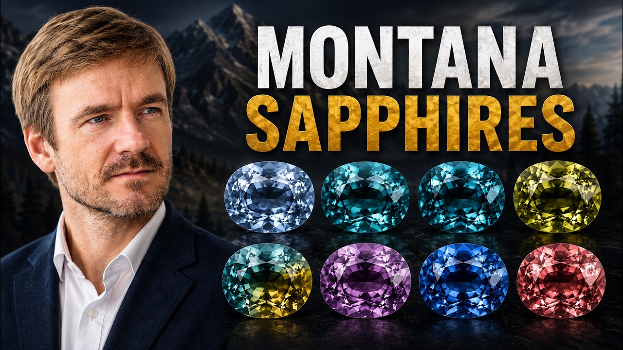
Montana sapphire
Montana can be an appealing origin for someone who wants an American connection. Some stones have the softer blue-green or grayish character buyers associate with mountain water; others show brighter, warmer or more unusual colors.
Montana is not a single color grade. It includes different deposits, and treatment, cutting and the individual crystal influence the final result. If the locality is part of the price or the ring’s story, ask what documentation supports it.
Australian sapphire
Australian sapphires can offer rich blue-green and parti-color directions, including stones with visible yellow zones. They can be excellent candidates for a moody or nature-inspired design.
But Australian origin does not automatically mean dark teal, just as Montana does not automatically mean pale or steely. The ranges overlap. Choose the actual appearance first, then verify the origin and treatment claims that matter to the purchase.
Lab-grown green and teal sapphire
Green and teal sapphire can also be grown in a laboratory. It is sapphire material, with laboratory-grown origin, and can offer useful control over dimensions, color direction or matching stones.
That does not mean every lab sapphire looks identical to a natural example, or that a growth-method name establishes quality. Inspect the cut, saturation and appearance in everyday lighting. Choose lab-grown when it solves the design or budget problem you actually have, with clear disclosure of what is being sold.
Choose the actual sapphire
Use mint, seafoam, olive, forest and teal as starting vocabulary. Then make the brief more precise: light or dark, green-dominant or blue-dominant, blended or zoned, quiet or vivid.
Compare the selected stone in ordinary lighting, consider it beside the intended metal and discuss the complete setting. Confirm written treatment information, relevant origin documentation and the seller’s current terms.
The goal is not to win an argument about which name is correct. It is to choose a sapphire that still looks right when it becomes a ring and moves through the wearer’s real life.

Frequently asked questions
Is mermaid teal always an exact fifty-fifty blue-green mixture?
No. Treat the term as a variable description. Share visual references and compare actual stones under useful lighting conditions.
Can a sapphire’s color prove it came from Montana or Australia?
No. Both origins can produce varied colors, and their appearances overlap. Ask what documentation supports the specific origin claim.
Choose the blue-green balance that feels right
We can compare the appearance you want, consider the actual stone beside the intended metal and develop a setting around its proportions and your partner’s life.
Book a NinaVova consultation or explore our custom design process.
Continue reading: Montana sapphire buying guide · Royal blue vs cornflower sapphire · Bi-color and color-change gemstones.
Sources and further reading
- GIA: Sapphire quality factors
- GIA: Sapphire overview
- GIA: Montana sapphires from secondary deposits
- GIA: Sapphire care and cleaning
Availability, prices and service terms can change. Evaluate the individual stone and confirm the current written terms before ordering.